With the launch of Ultimate Brain 3.0 in November 2024, we’ve done away with many of the complex, multi-column layouts from previous versions.
While this change makes for less awe-inspiring screenshots, we think it’s a change that will improve your productivity and making working with UB easier.
Simply put, multi-column interfaces often make working with Notion clunky. There are exceptions, of course – the new Chart blocks absolutely scream for multi-column reporting dashboards, for example.
But for database views that assist with navigation – e.g. those that allow you to open pages that contain Notes, Tasks, Tags, etc. – multiple columns hurt more than they help.
Why, you ask? Here are a couple key reasons.
Copy link to headingSide Peek Adds “Columns” Directly to Notion
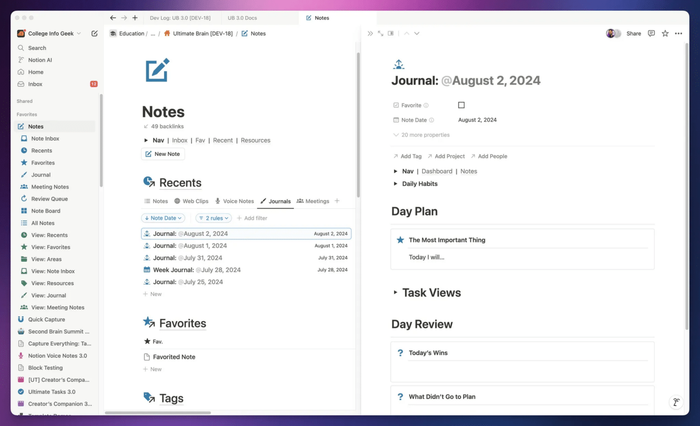
Ultimate Brain is built around Notion’s Side Peek mode, which opens database pages in a flexible side window to the right of the current page.
In a single-column layout, this is very useable. If your main page is using List layouts for database views, they adapt their width when a page opens in Side Peek. This means you can switch between pages (e.g. Notes) very quickly.
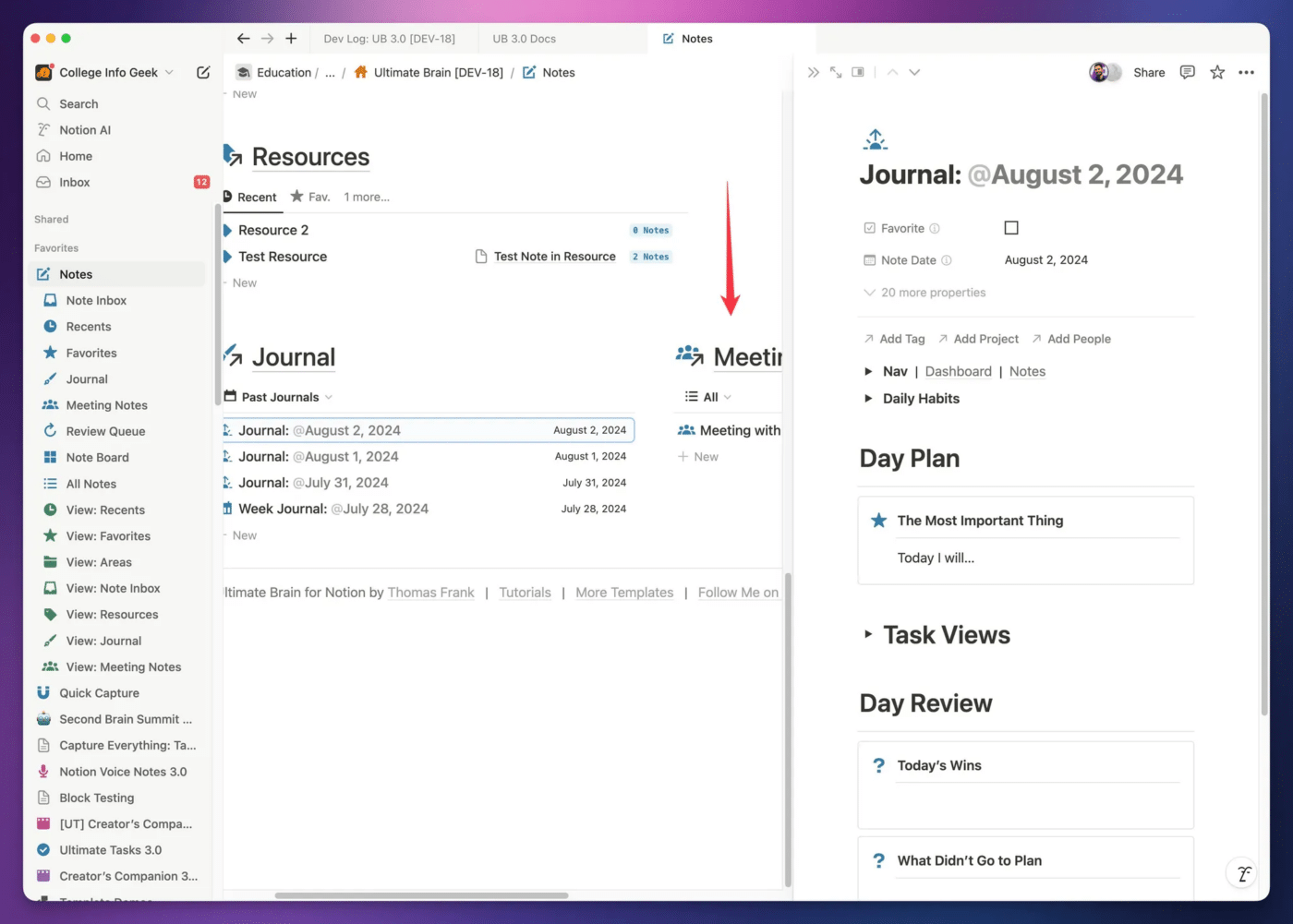
However, this breaks down when the main page has multiple columns. If you want to access the content of anything other than the left-most column, you have to scroll horizontally.
Copy link to headingTabbed Database Views
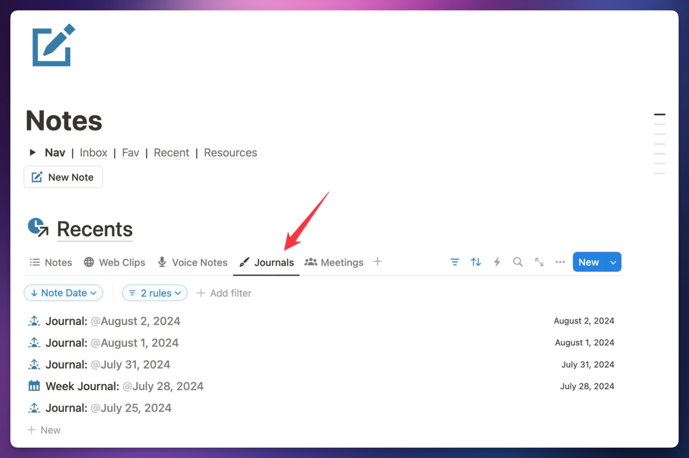
Linked database blocks in Notion can now show their different views as horizontal tabs. Switching to a single-column design allows you to see more of these tabs, even when the entire Notion window is constrained to a smaller width.
This also means we can add more views to the same Linked Database block without harming the user experience.
In the past, we didn’t have as much flexibility around adding views to a Linked Database block, which meant we often needed to add several of them to the same page. Back then, this meant that a single-column layout would result in a very long dashboard page. Multiple columns solved that problem.
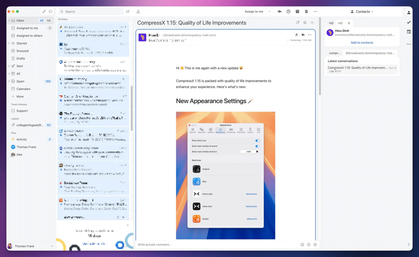
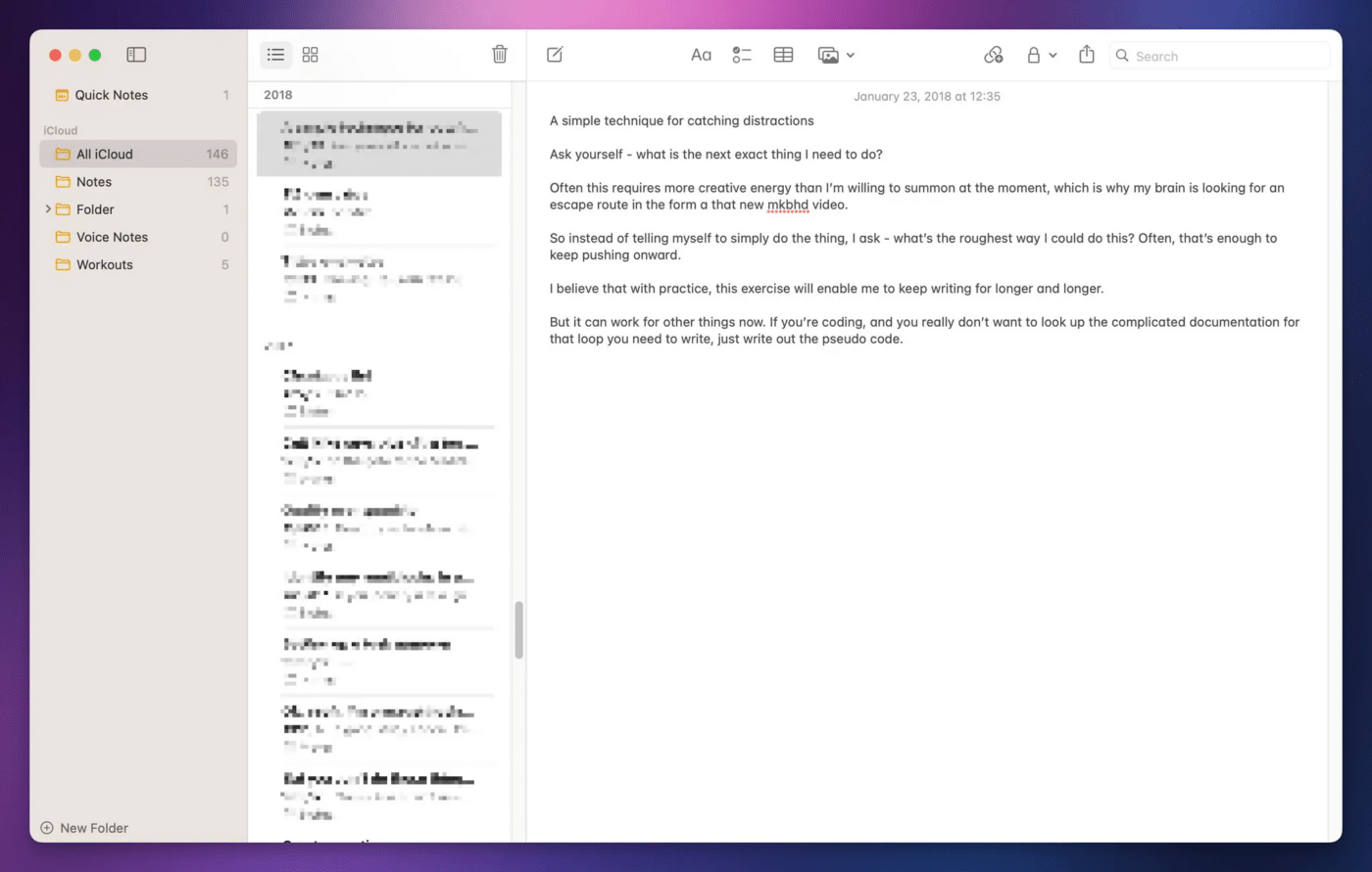
Now that we have these tabs, I think it makes sense to switch back to a single-column layout for most dashboard pages. This makes each dashboard work more harmoniously with the entire Notion UI. It brings us back to a tried-and-true UI pattern that works so well that we see it everywhere, including email clients:
As well as note-taking apps:
I often like to call this a “drilldown” UI. I’m sure there’s a real term for it, but in my head, you’re “drilling down” (well, actually to the right) to find exactly what you need.
Copy link to headingAdding Columns Back to Ultimate Brain
Ok, you’ve read all my arguments above, and you’re still like,
“Tom, I love you, but you’re tripping. Give me back my columns.”
Luckily, adding columns to a page in UB is extremely easy:
- Click the
+button on any block to create a new, blank block below it. This is where your columns will live. - Type
/2cfor two columns. You can also do/3c,/4c, or/5cif you really want, but keep in mind that the more columns you add, the faster they’ll get squished and hard to use at smaller window widths. - Click and drag to select a Linked Database and its Header.
- Drag them into one of your new Column blocks.
You’re done!
If you ever want to get rid of your multiple columns, just click and drag to select your database and header again, then drag them beneath the multiple-column area until you see the blue preview line take up the full width of the page.


