
Notion gives us a lot of opportunities to customize our space both internally and with the use of external, third-party widgets. Indeed, a quick search of Reddit or Pinterest will return gorgeous Notion spreads, including external widgets like calendars, counters, and playlists.
While they look amazing, I always have a single question—doesn’t that distract you? Luckily, you don’t need extra widgets to make your pages beautiful, Notion gives us lots of options to customize our spaces, including:
- Callout blocks and toggles
- Colors and fonts
- Hiding text and properties
- Three different ways to display cover images in database embeds
In this guide, I’ll share several easy tips you can use to make your Notion workspace and dashboards more aesthetically pleasing—without sacrificing functionality and speed. These tips can help our spaces go from this:
To this:
Ready? Let’s go!
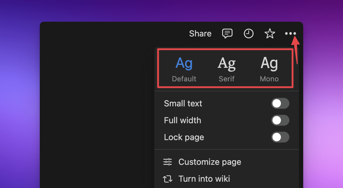
1. Customizing Page Settings
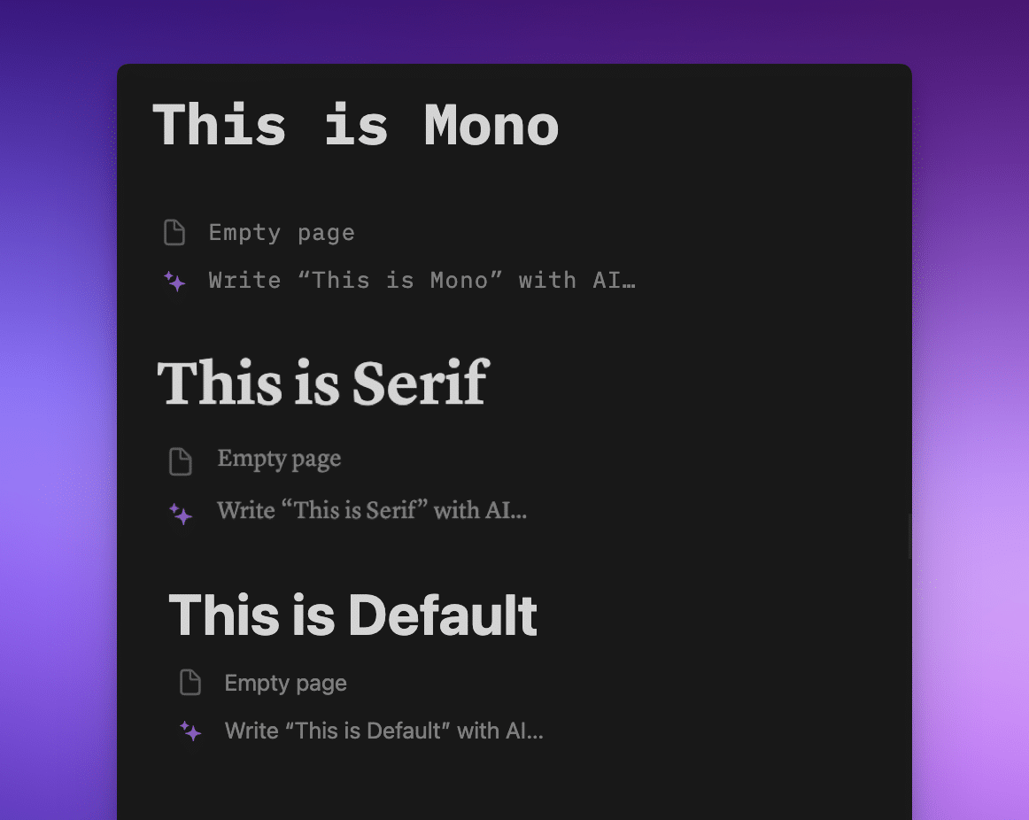
Notion gives us options for how we want to display each page. Here are the different fonts available in Notion:

Pop your cursor at the top right of any page or database item, and click the 3 dots ••• at the top right of the page to reveal some options we can use to change how the page looks.
We can change:
- The font style
- Default = sans serif (think Arial)
- Serif = with hats & feet (think Times New Roman)
- Mono = monospaced/fixed-width (think code or programming languages: where each letter takes up the same space as all the others)
- The size of both the title and the text on the page
- The page width, from slim to full
Note: I have a small issue with this: you can’t change your whole space from the Default style to Serif or Mono, you have to change each page individually, including sub-pages.
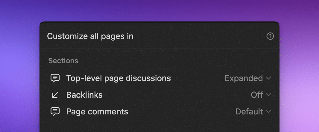
We can also click Customize page and decide how we want discussions, backlinks, and comments to show up on our page.
Note: If you’re inside a database item (rather than a dashboard/page you’ve set up), this will change for all pages in that database.
2. Using Native Notion Icons
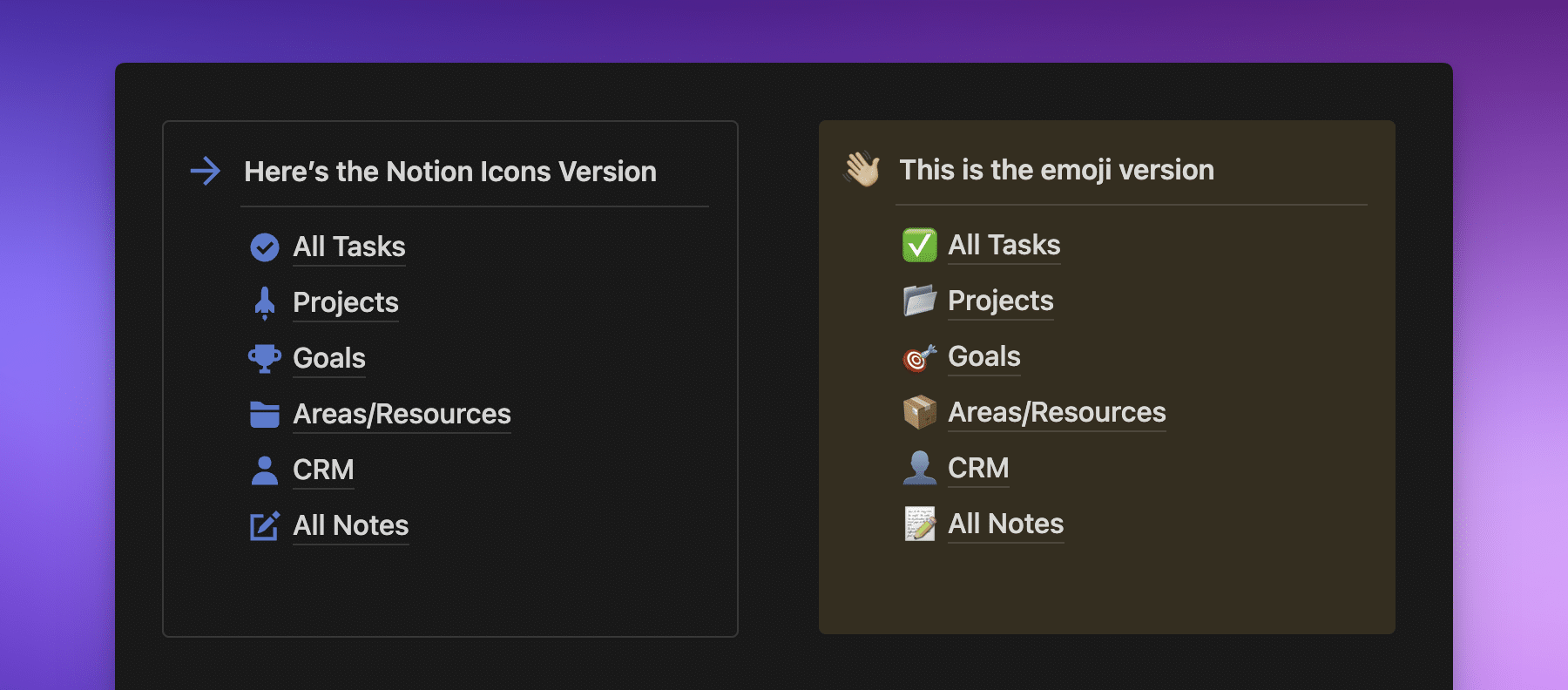
I don’t know about you, but I love some character in my page icons. Take a look at the difference between these two images, with emojis on the left and Notion icons on the right.
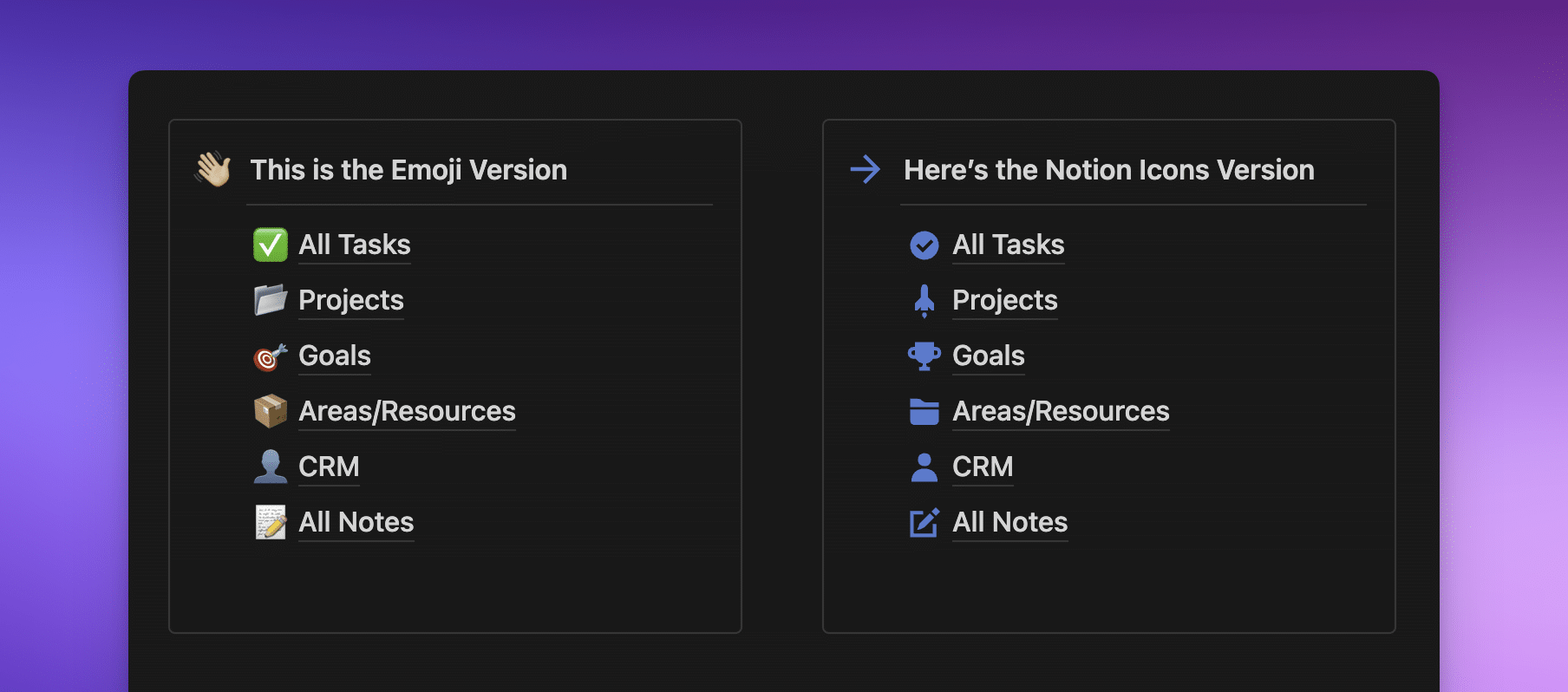
The ones on the left are great, but the ones on the right look more “put together.” They both get the job done, but having an icon convention in your Notion space can remove some of the perfectionism that can come from finding the perfect icon for a page.
I’m as guilty of this as the next person, so removing this from the equation means my space always looks coherent without spending an hour picking the right kind of icon!
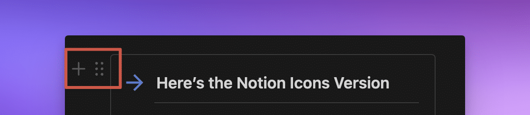
Here’s how to pick one of the Notion native icons:
- Click on an icon
- Click on Icons
- Pick a color from the Color Picker
- Scroll to find the one you want, or write in the Filter box to find the one you want to use and click on it to use it as the icon

Using Third-Party Notion Icons
If Notion’s native icons just aren’t doing it for you, there are other options!
In 2021, I downloaded Tasia’s gorgeous Notion Icon set, which includes neons and metallics, and I still use them today.
I also love Eli’s Notion icons on Gumroad, which are equally stunning.
There are a lot of third-party icon packs that aren’t specific to Notion, such as Iconic and Iconify. Have a look around and see which ones you like best! Try (if you can) not to download too many because you’ll spend more time picking the right one among the million you downloaded—been there, done that!
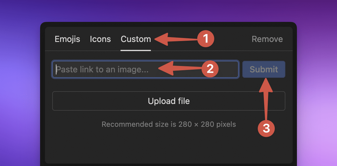
Pro Tip: You can also link to external URLs for page icons. To do this, when picking an icon, click on the icon and then Custom from the modal. From here, rather than uploading your own, paste the link to the icon you want to use. Be aware, though, that if the URL changes (or is removed), the icon will stop working.
In his video on the Notion API, Thomas automatically brought in all his icons using a URL. You can check out his Crash Course here:
Or, if you’d prefer the written version, head here for The Complete Notion API Crash Course for Beginners.

3. Styling Callout Blocks
If you were paying attention to the previous tip, you’ll have noticed that the Callout blocks in the screenshot don’t look like normal Callout blocks.
Here’s the difference:
The Callout block has a yellow background on the right, and on the left, there’s only a subtle outline. Which one you decide to use is up to your personal preference. I prefer the subtle outline.
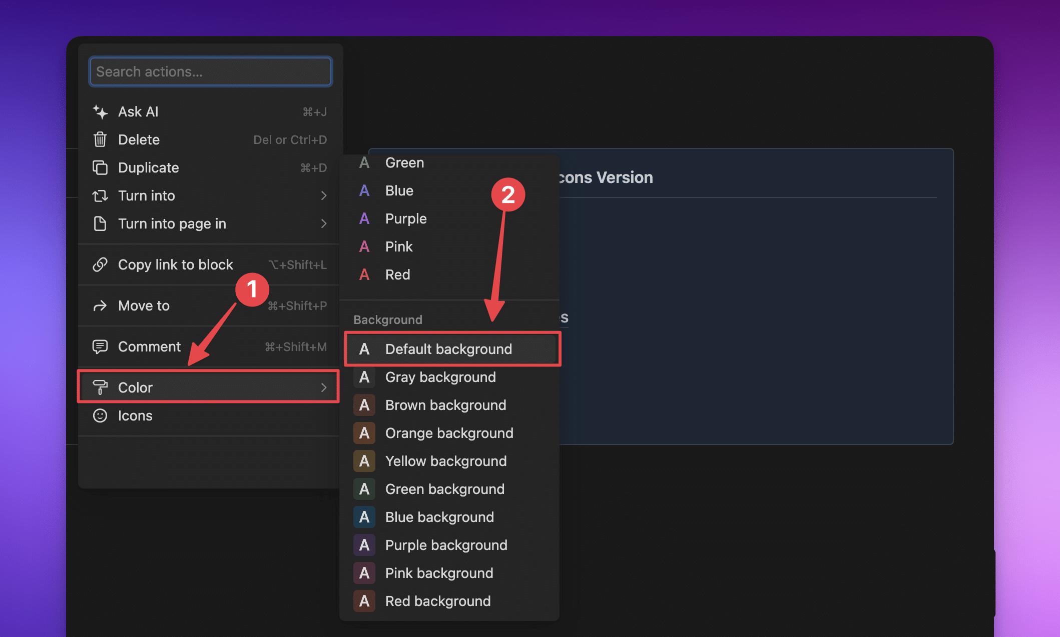
To get this outline, hover on the + ⋮⋮ on the left-hand side of the callout block:
Then:
- Hover your cursor over the Color option, which will open up the next menu, where you can…
- Pick Default in the Background section (not the color).
That will give you a subtle grey outline in light and dark mode rather than a solid background color.
4. Adding Multiple Blocks to Callout Blocks
If you’ve been in Notion for any length of time, you probably know that Callout blocks are a bit tricky. After you’ve put in your title and pressed enter on your keyboard, your cursor is out of the callout block.

However, if you press Tab, your cursor will pop right back in there again, creating a new line.
More than that, you can type - - - and you’ll get a lovely line under your heading. You can add other blocks inside it—even Toggles, linked databases, and external embeds!
Note: If you use Shift + Enter, you’ll get a second line in the same block, but it’s not a new line or a new block; Notion views it as a continuation of the first line, meaning you can’t pop a dividing line between them.
5. Using Toggle Blocks to Hide Menus
If you have pages you use all the time, you might be tempted to have them all at the top of your main dashboard. However, if you have too many, this can look cluttered.
The alternative is to have a Toggle block with your pages hidden neatly inside:
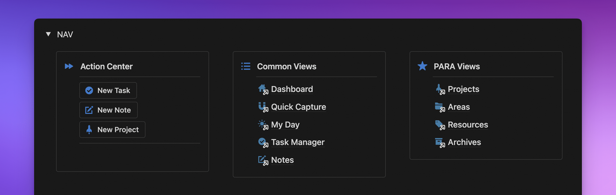
Doesn’t that look awesome?
Pro Tip: Yes, you can have columns inside Toggles and Callouts in those columns!
It hides the menus neatly away in a Toggle block, but they’re there when you need them.
Here’s how to do it:
- Create a Toggle block (by typing
/toggleinto a clear line). - Inside the Toggle block, create 3 columns (by typing
/columnand selecting 3 from the list). - In the first column, create a Callout block (by typing
/callout) and duplicate it twice. - Drag the duplicates into the other columns.
- If there’s something you want in there, you can use
@to mention the page or database.
I also love putting a List view of my common database in there. This gives me direct access without using @-mentions and is more streamlined than listing them all individually.
Note: You can put Notion Buttons in your Toggle Blocks as well (in the video, they’re in the left-hand Callout).
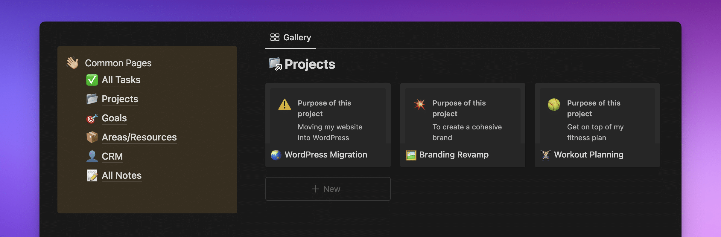
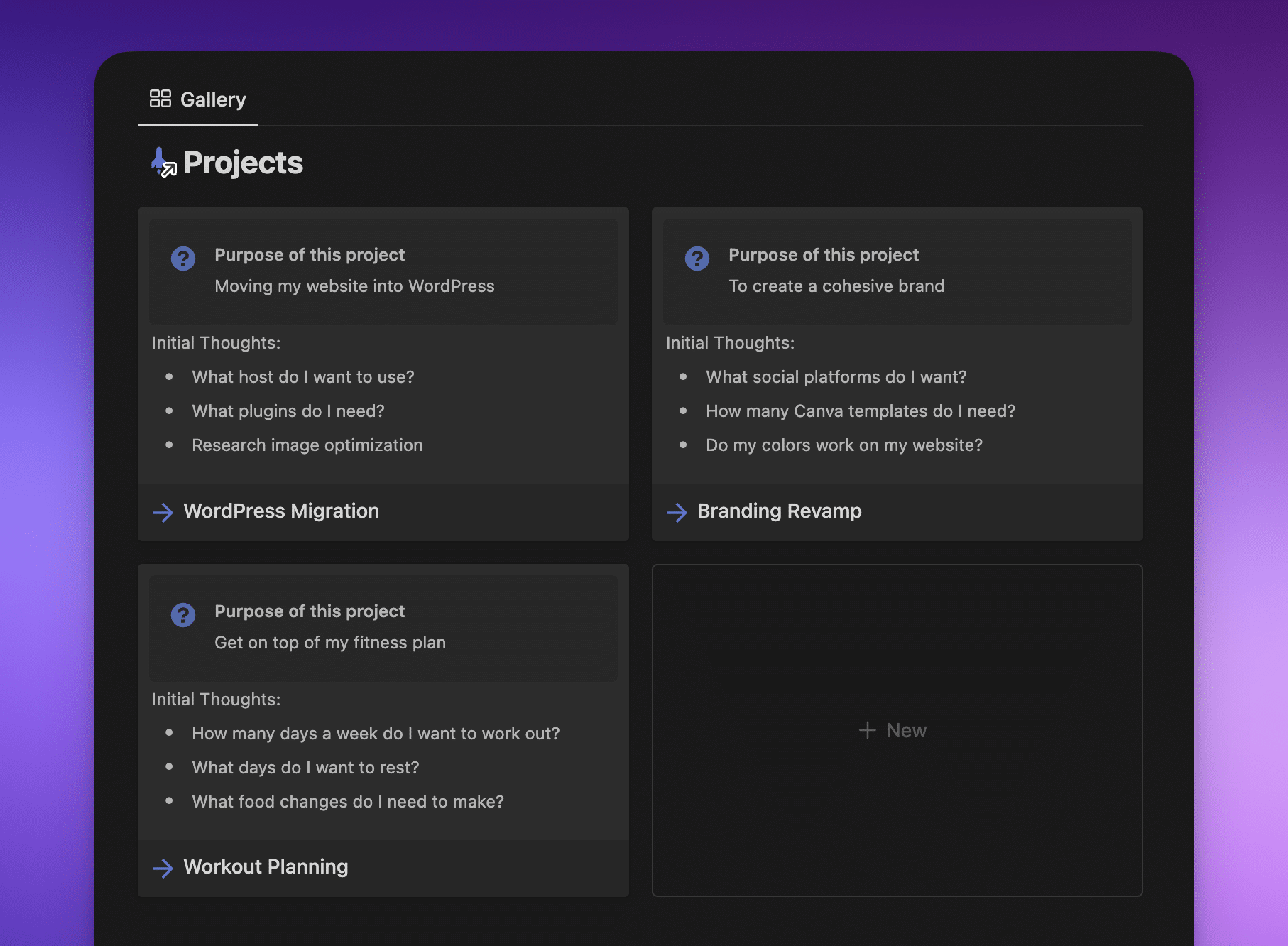
6. Show Page Covers in Gallery and Board Views
By default, any time you create a Gallery or Board view, the cover shows the page’s content. This can be helpful because it shows the top section of the page, where you might like to add the purpose of the project, including initial thoughts, etc.
This is what that looks like:
If you don’t want to see the inside of the page, you can add a stock image as the page cover in Notion. Which can end up looking more like this:
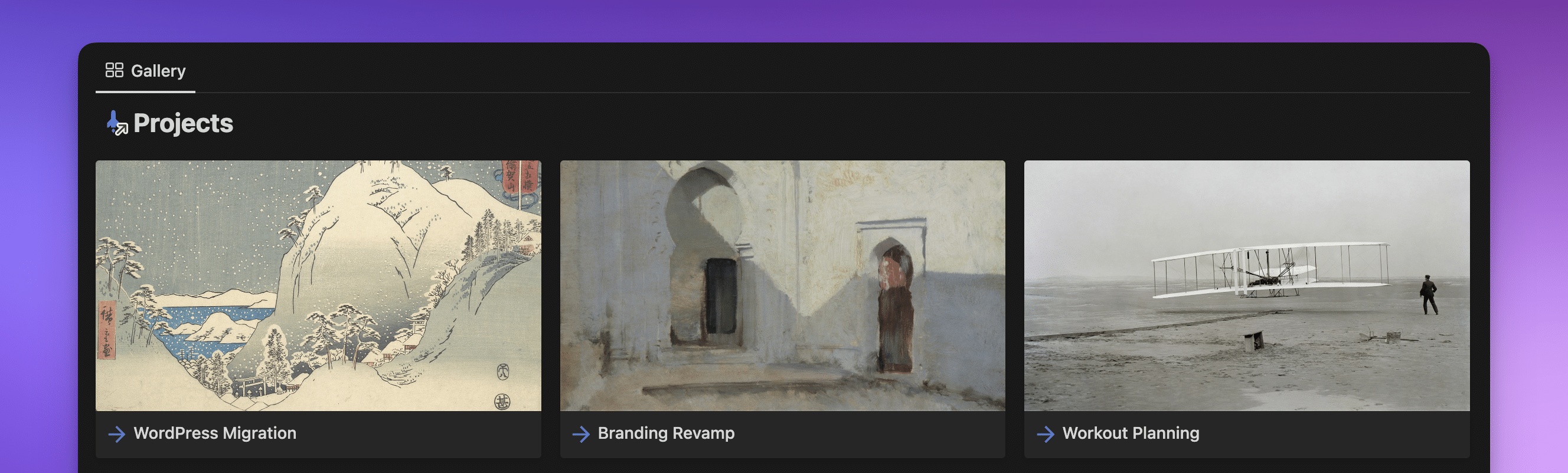
These add an aesthetic touch to your gallery, but they’re probably not you.
Personally, I head to Canva and create a 1600 x 900-pixel graphic and design something more personal that matches my aesthetic, which ends up looking something like this:

Notion covers should be wider than 1500 pixels, so 1600 works perfectly.
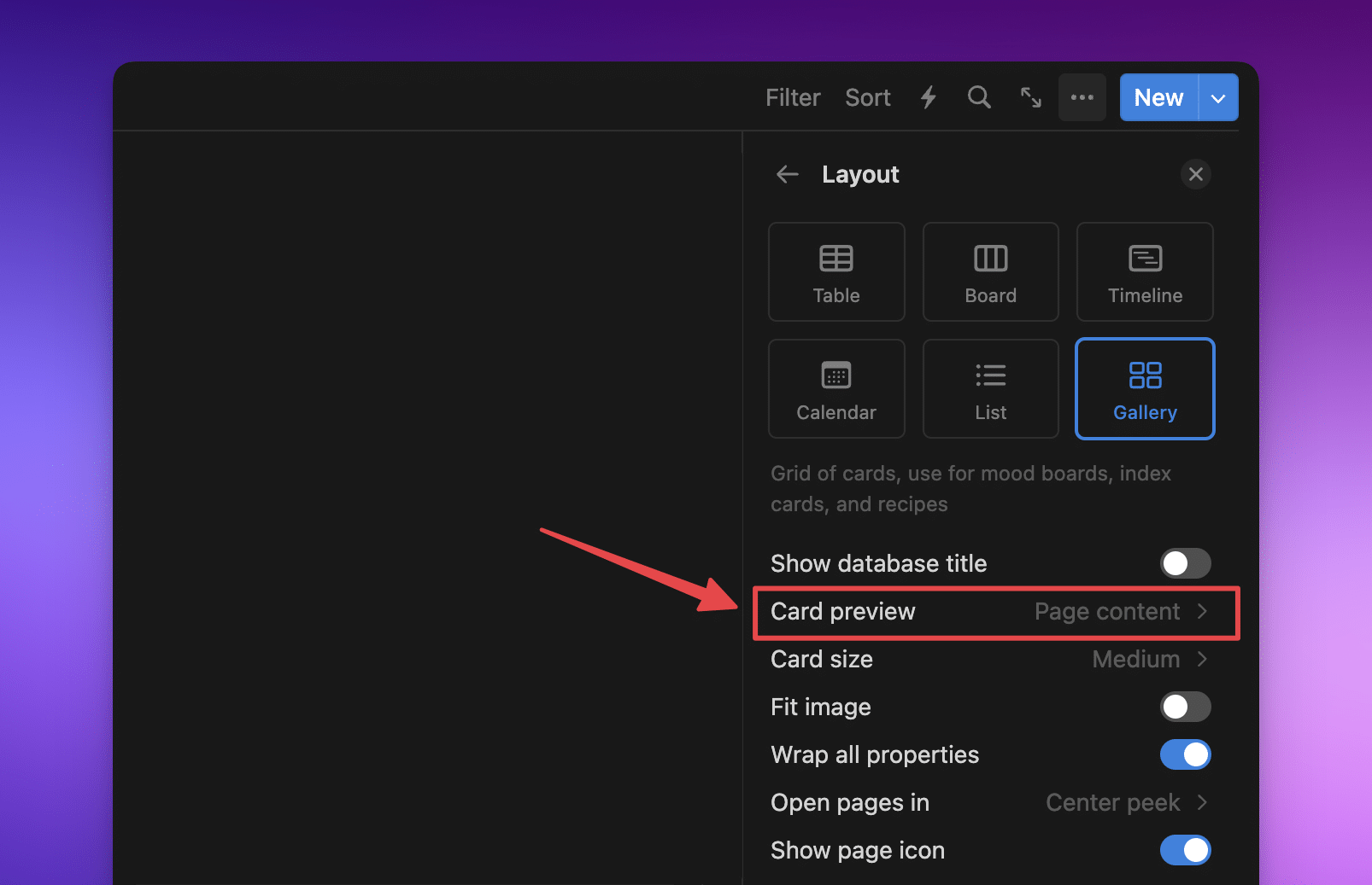
There are a couple of different ways to show curated covers: you can add them as covers to the pages themselves, or you can pop them into the page itself and then pick what to show.
If you add the image as a page cover and want to see it in a Gallery or Board view, pick Card Preview, then Page Cover.

If you add an image to the body of the page, you can pick Page content.
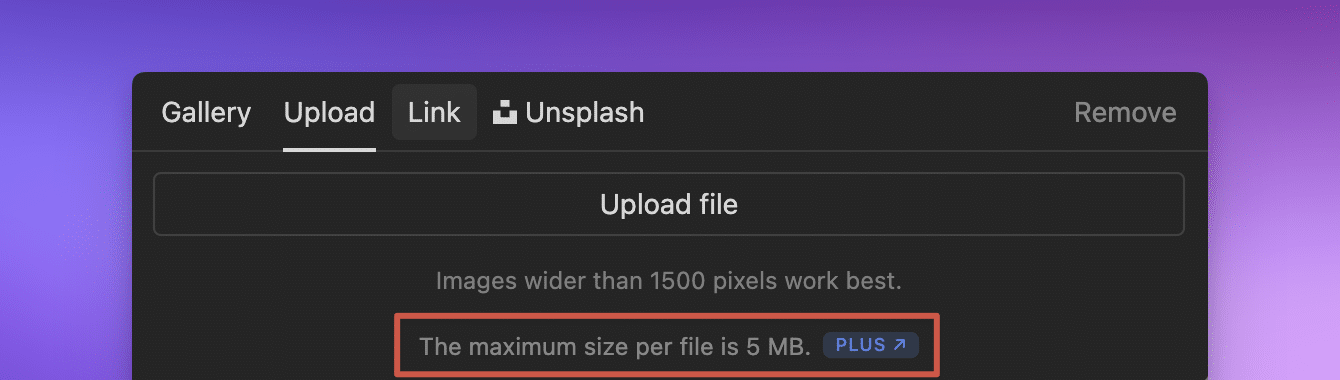
Note: If you’re on Notion’s free plan, you can’t upload images larger than 5 MB. Head to Tiny PNG and upload it there. It’ll minify it for you and should be smaller than the 5 MB limit.
Using the Files & Media Property for Page Covers
The Page Cover and Page Content options will add visual elements to the actual page when you open it. These might take up more space on your page than you’re happy with.
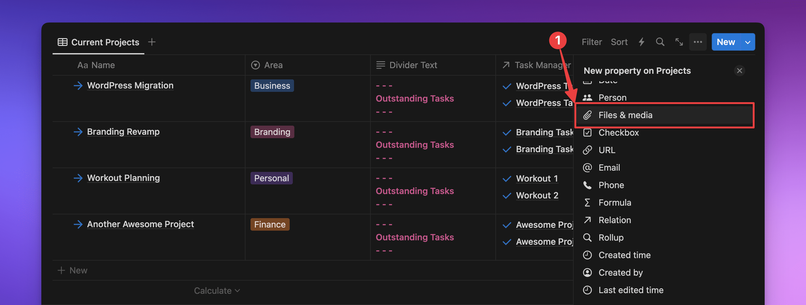
Luckily, Notion has a Files & Media property, allowing you to add images directly to a property.
Why would you want to use this method instead of the others?
Adding your cover image to a Files & Media property allows you to hide the property everywhere in your space whilst still being able to display it where you want. Even when the property is hidden, it’s still an option for a Board or Gallery cover. This can help you save precious space on your page by not having a large cover or an image in the body right where you want to work.
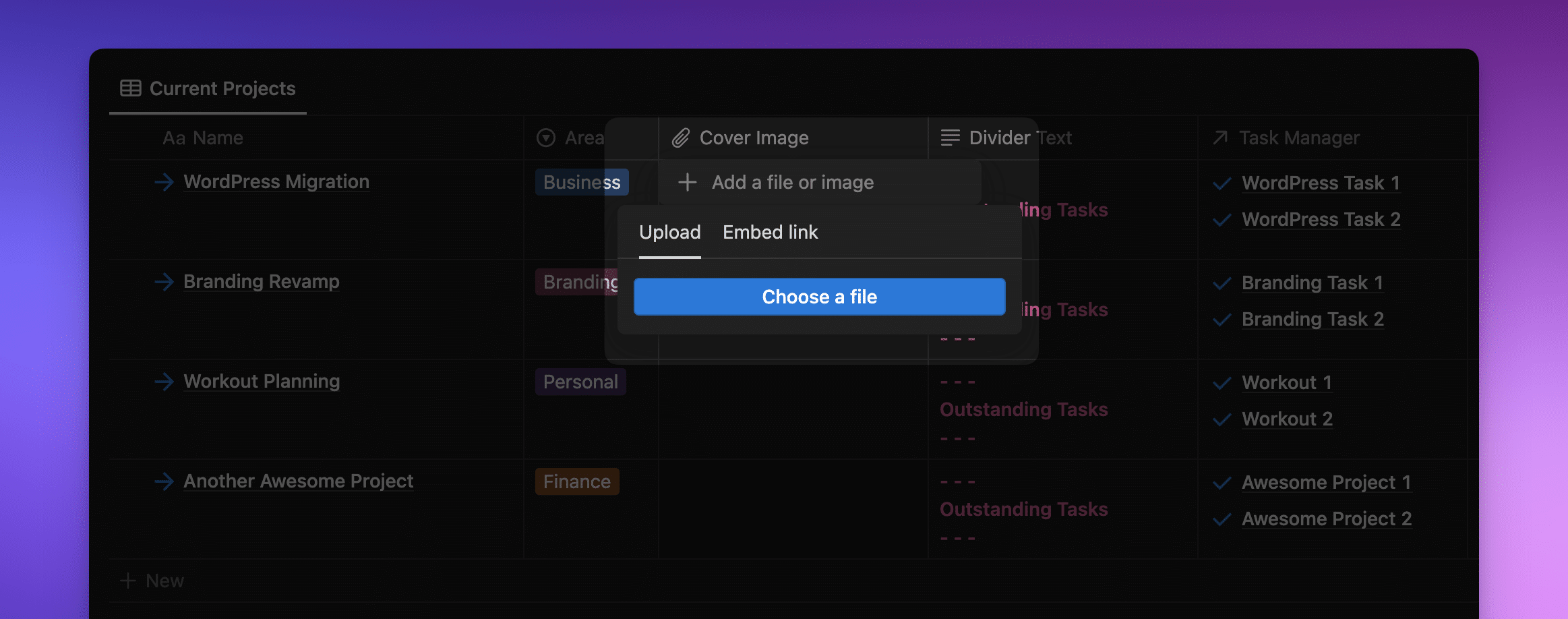
Note: Not only can you add a downloaded image to this property (along with other documents), but you can also add an image to this property through a link.
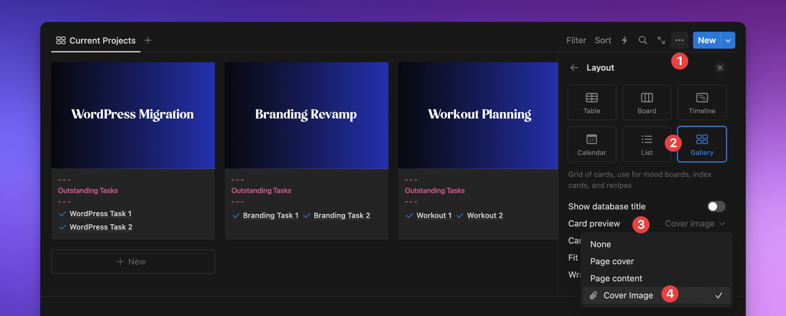
You can pick a Files & Media property as your cover on a Board or Gallery embed. To make this property your cover image:
- Click on the 3 dots
•••on the top right of your embed. - In Layout, select Gallery or Board.
- Then click on Card Preview.
- Select your image property, the one with the paper clip icon (in this example, my property is labeled Cover Image).
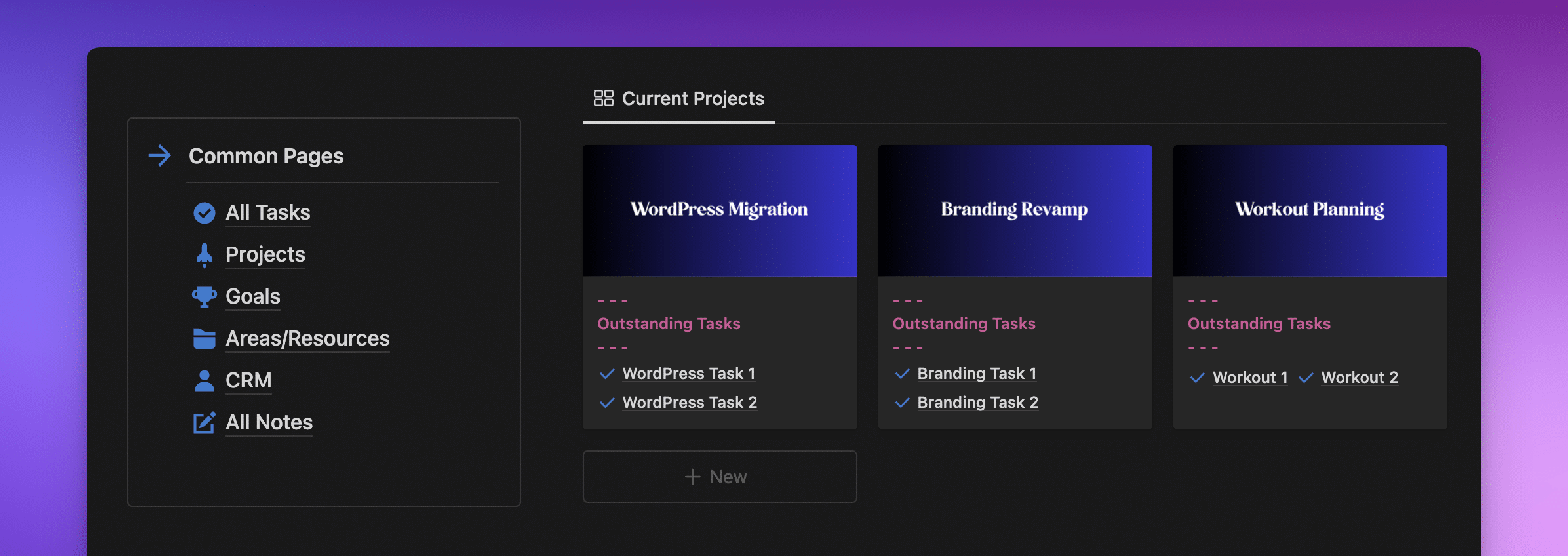
Look how much room we can save inside the page by adding our cover image to a property rather than having it as the actual cover of the page.
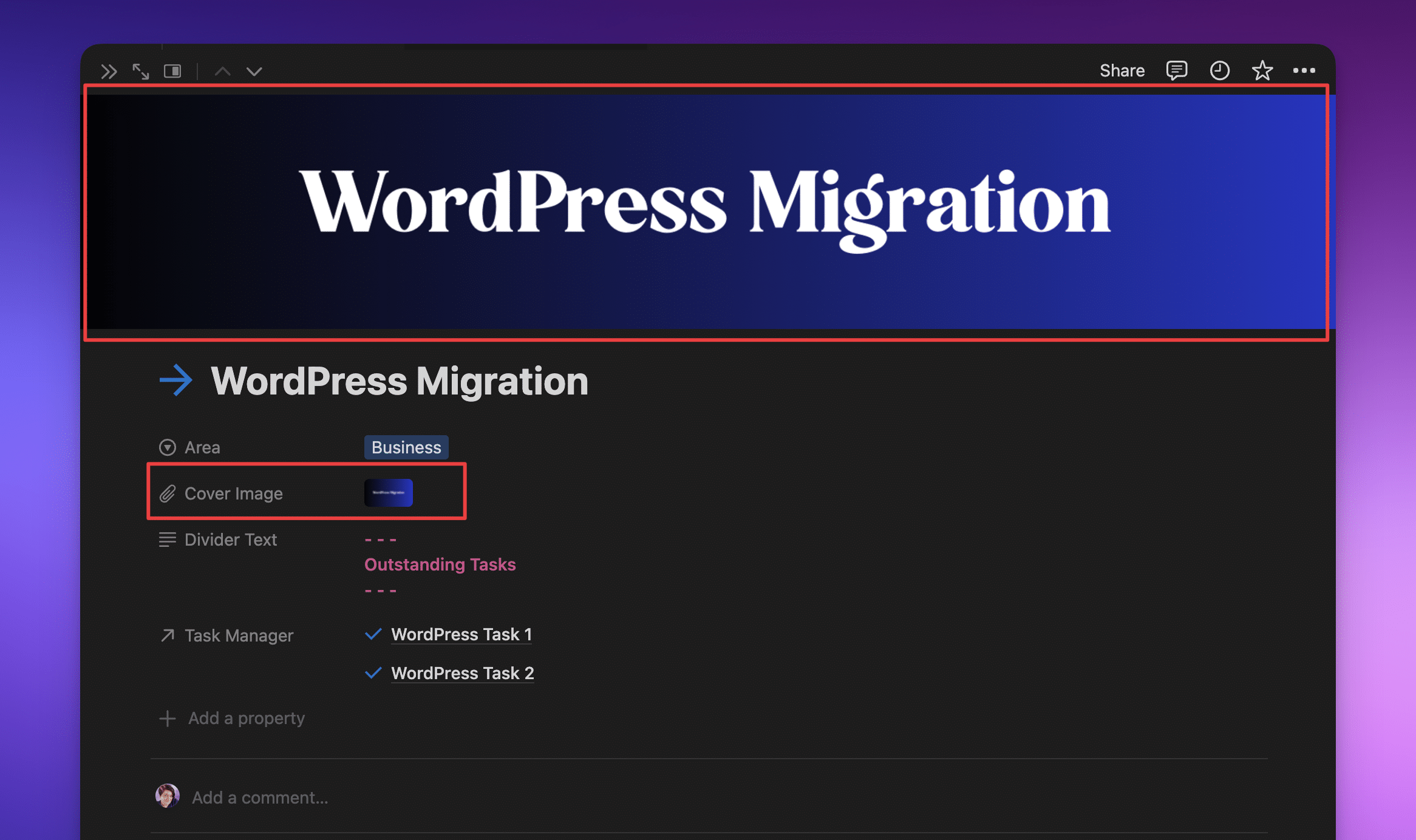
As it’s a database property, we can hide it at the top of the page and save even more room. A page cover can’t be hidden—it’s either there or not. Using a property, we can add a beautifully aesthetic cover in embedded views without messing up the aesthetic inside our pages.
Embedded Database Aesthetics in Board and Gallery View
In addition to selecting the covers we’d like to display in our Gallery and Board views, we can make a few more tweaks to clean up our pages when we have those kinds of database embeds. We can:
- Hide the database title
- Hide the title of the page
- Change the name of the view
Here’s a video to show you how!
Note: You can only hide the Page title if you have a cover selected.
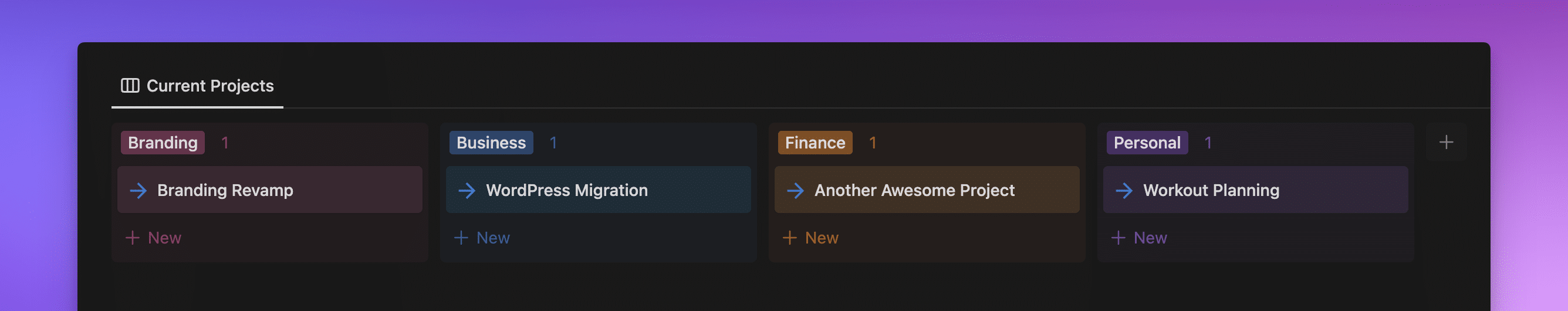
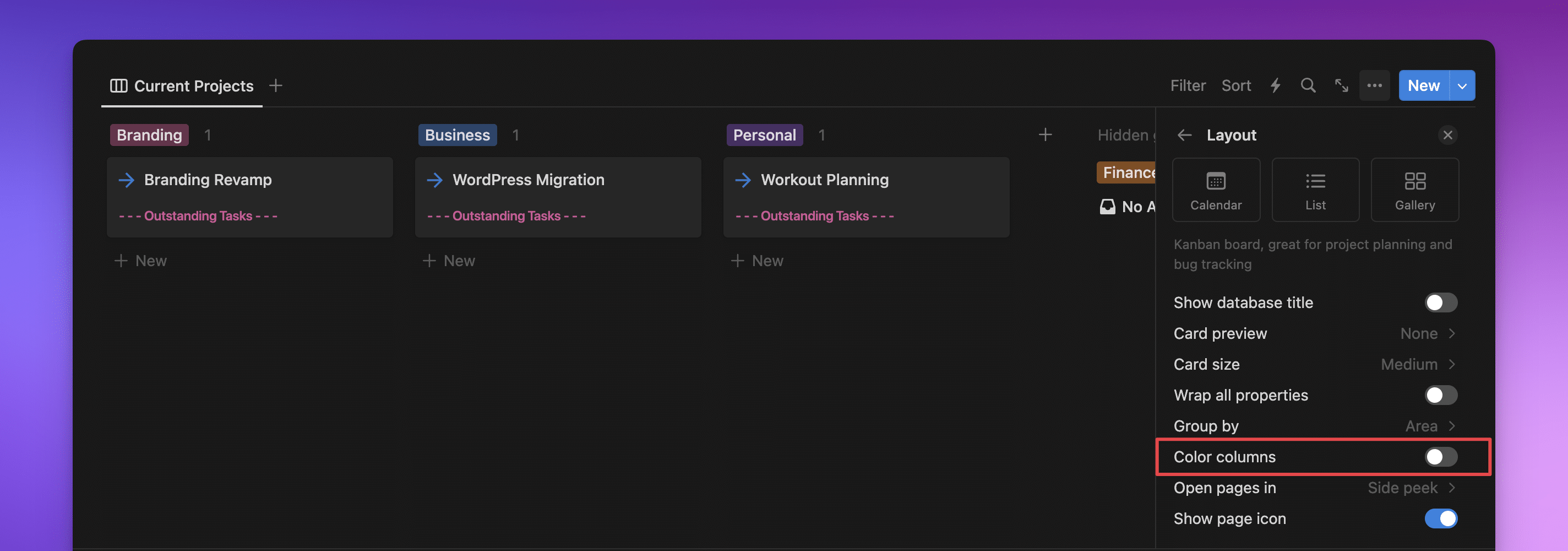
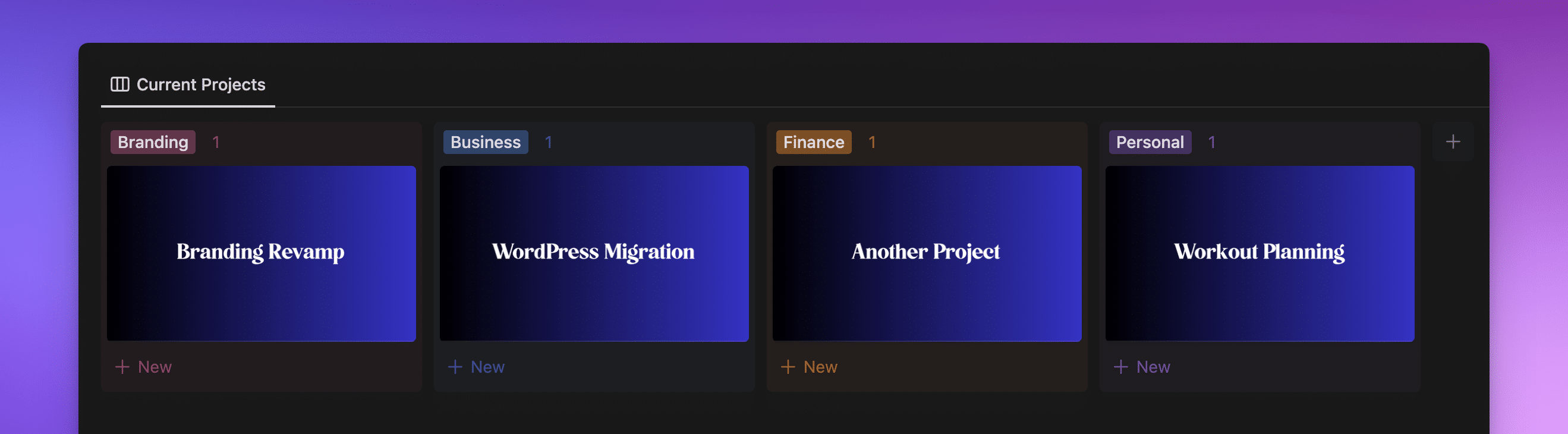
7. Coloring Columns in Board View
We can also color our Columns when viewing databases in a Board view.
In a Board view, under the Layout settings, you can scroll down and see the switch for Color columns. The Columns will inherit their colors from the select or multi-select property you picked for your layout, and are limited to Notion’s color palette. This works the same for both light and dark mode.
If you want to see your Page titles but don’t want to have the page icons‘ visual clutter, you can also turn that off here with the Show Page Icon option.
This already looks pretty great. Let’s take it further! Let’s show the page cover and hide all our properties:
Here’s how:
- Head to the 3 dots
•••at the top of the database embed. - Click Layout and either pick the Board view or scroll down to settings if you’re already in a Board view.
- When you’re inside the Board view settings, scroll down, and toggle on Color columns.
- While you’re in this view, you can also toggle the Show database title option or use the Card preview, Card size, or Fit image (only available if Card preview is not set to none) settings to change the way the page covers are displayed.
Note: You won’t be able to hide the Name property if you’ve not chosen a cover. As soon as Card preview is set to something other than none, you’ll be able to hide it just like any other database property.
8. Adding Colored Text Properties as Dividers
Another way to add a bit of flair to a database embed is to create Text property to use as a divider, and display them on Gallery and Board views. These can help you divide sections of the database without needing any code or difficult workarounds.
Here’s how it looks:
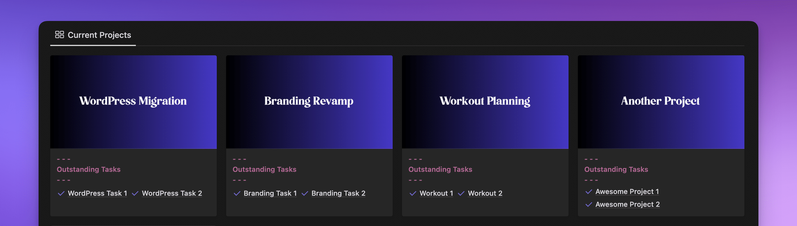
Here’s how to do it:
- Add a Text property, in this example I’ve named it Divider Text.
- Type what you’d like the divider to say, and style it however you would like. In this case, I’ve made it bold and colored it pink—to get multiple lines in a single text property, use Shift + Enter.
- Decide if you want all of them to say the same thing or add different text to the property for the different projects.
- Create a Relation property to show the tasks related to the project.
- Change the view from a Table to a Gallery view.
- Change the Card Preview to Page Cover, and turn on the visibility for the Divider Text property and the Relation to the tasks database.
Important: I didn’t need to hide the page title because it was already hidden, but here’s where you can hide that as well.
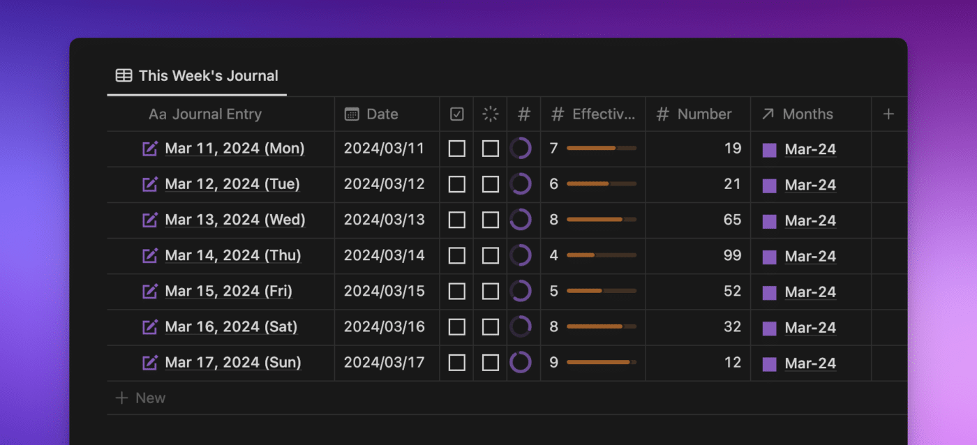
9. Creating Colored Progress Bars
While we can’t color numbers in a Number property, we can add rings or bars to help visualize our data.
I love using these in my daily journal as a happiness and effectiveness rating, and I love that I can match them to my Notion aesthetic too!
This is how they look in my space:

Pro Tip: If you’re looking to populate your journal dates with the minimum amount of fuss, here’s a link to my public Google Sheet with all the dates already added. Sometimes, Notion doesn’t cope well when you paste a whole year in at once, so limit it to a month or two at a time!
You can also utilize Repeating Templates in databases to create daily database entries if Google Docs doesn’t work for you. Thomas’ Beginners Guide to Notion has a great section on how to set up and use the Repeat feature.
To create a daily journal that looks more aesthetic, here’s my process:
- Create a Date property and move it to the left of the Name property.
- Copy & paste my journal titles and dates into the database.
- Sort the database by the Date property.
- Select all of them and bulk add an icon.
- Add a number property called ‘Effectiveness’ and another titled ‘Happiness.’
- Head into the Number property settings, select a circle, change the color, and change the Divide by number to 10 instead of 100.
- Click on the Date property heading and change the format to Year/Month/Day.
And, of course, I hide the Database title as well.
If you want these steps in a video, I’ve got you covered:
Note: Notion allows you to have circles and bars; so use whatever makes the most sense for your space and aesthetic!
10. Resizing Properties in Table View
Not all properties are created equal, and we want to see them in different ways. One of the tricks we can do is change the width of the properties depending on what kind of property it is.
Let me explain! Status, Checkbox, and Number properties can be resized to be small enough that their names are completely hidden, showing only their property icons.
To resize columns:
- Put your cursor between the two properties until you see the light blue bar appear.
- Press down on your left mouse button and drag to the left (or the right if you want to make the property wider).
- Let go of the button, and hey presto!
Unfortunately, there’s no way to get the default width back to the columns once you’ve changed them, even if you hide the properties and show them again. There’s also no way to resize multiple columns at once so they’re the same size.
Freeze Columns
Sometimes in a Table view, we want to see a lot of information and maintain the context of what we’re looking at.
Luckily, Notion has given us the ability to Freeze columns. This means we can maintain the left side of the Table and, when we scroll left to right, still see the rest of the properties.
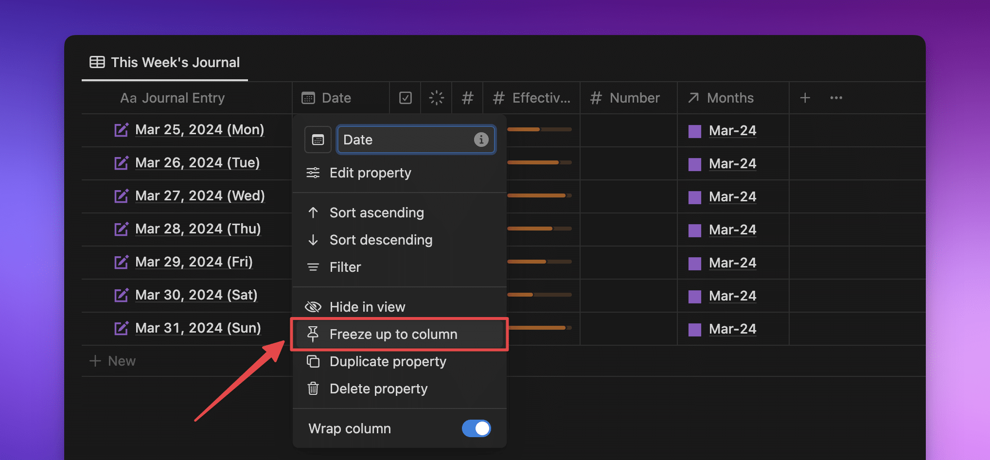
Why would we need this?
I have a few columns in my Months database in this video, and there are too many to fit on the screen at once. When I freeze the Name property and scroll from left to right again, Date and Name stay pinned in the Table view, while the others scroll and hide under the frozen columns.
Freezing the columns allows me to see what projects I’m working on this month. Without freezing the properties, they’re hiding off the right-hand side of my screen.
11. Wrapping Properties Across Different Views
In a Gallery view, the title is already wrapped (so it shows the full title). However, we can pick other properties and choose whether to wrap them or not. In this example, I’m wrapping and unwrapping the Divider Text property.
In a Calendar view, we have the ability to wrap titles (or not), but these can be tricky to find.
- Create a Calendar view from a database.
- Pick whether you want to view it monthly or weekly.
- Head into the 3 dot menu
•••and select Properties. - Click on the > next to the Name property.
- Toggle on (or off) Wrap in view.
Prefer a video version?
Note: You can also pick wrapping per property in a Board view!
12. Choosing Display Length for URL Properties
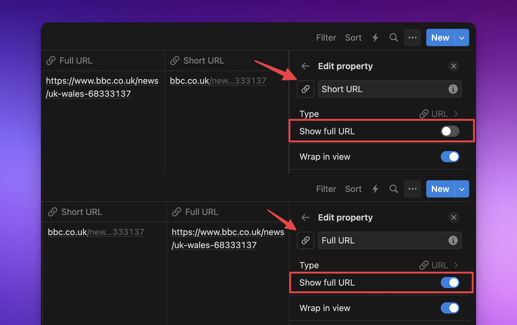
A recent addition to our aesthetic toolbelt is our ability to pick how URL properties are displayed.
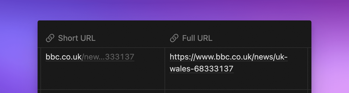
By default, Notion displays new URL properties in a shortened view, but we can change it to show the full URL if we want to.
When you create the URL property, you can decide how it’s displayed. However, you can always change your mind and change it back!
- Left-click on the URL property title.
- Click Edit property.
- Flip the Show full URL switch to the one you want.
Depending on the look you’re going for, you can pick whichever way fits your page best.
Important: This will change it for the whole database, so make sure that’s what you want.
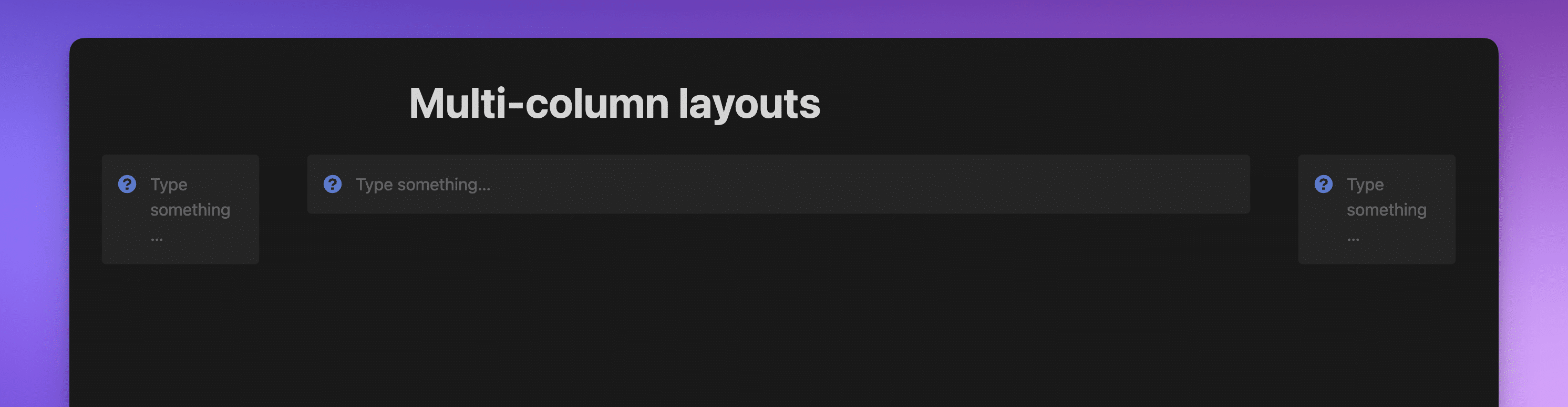
13. Creating a Multi-Column Layout
This is such a cool trick inside Notion and means we can stretch content out of the narrow view without setting the page to full width.
Why would we want this?
I’m glad you asked!
Imagine you’re writing a blog post and want to have an optimal line length inside the page without setting the page width to full. You can use a multi-column layout to give you the space you want in the center of the page. Plus, you can add an image above your new layout, and it will only span the original width.
When you combine these two, you can begin to see what your blog post will look like on your website inside Notion. Here’s how:
- Inside your page, create 3 Columns (by using
/columnson a clear line). - In this example, I’ve created a Callout block, then duplicated it (by using
/callout) to illustrate how it works, but you don’t have to use Callout blocks! - Head to the right-hand side of the right-hand column find the grey vertical line, then drag it to the edge of the page.
- Make the right-hand column super small, and do the same for the left.
That’ll give you a lovely wide column in the middle that’s wider than the page was originally. And, of course, here’s a video to show you how!
14. Hiding Page Properties
Earlier we talked about adding visual dividers to a Gallery view so that we can make them more aesthetic. However, when you have a few of these, it can make your pages really busy at the top.
Let’s look at how this could look when we’re in a Monthly database, adding information on our focus for the month:
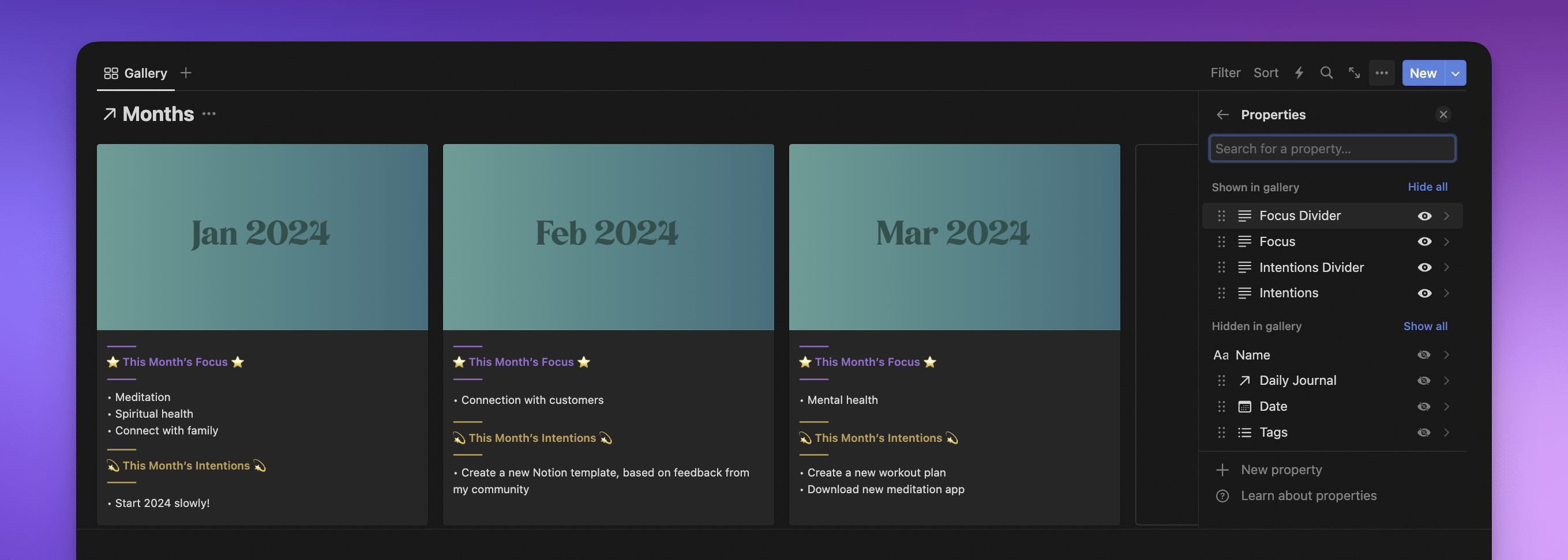
Here I’m showing 4 Text properties:
- Focus Divider
- Focus
- Intentions Divider
- Intentions
These are great for Gallery or Board view because they show me my vision and trajectory for the month (and showing January–March shows me my trajectory for the whole quarter, which is super nice!), but what does this look like inside the page?
I think you’ll agree, this looks too busy to be useful. So what can we do about it?
When you add properties to a Table view or in the original database, they’re added to the page in alphabetical order. As you can see above, Focus is before Focus Divider, which is the wrong way around to make sense.
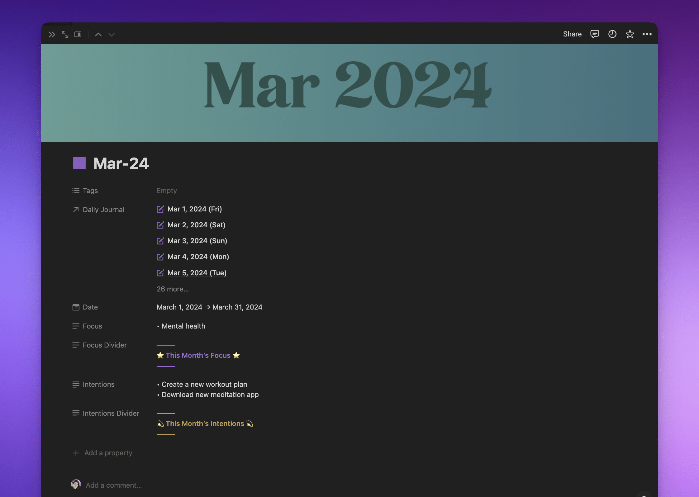
Note: Each property has 6 dots ⋮⋮ on the left. Grabbing these allows you to drag and drop the properties into the order you want.
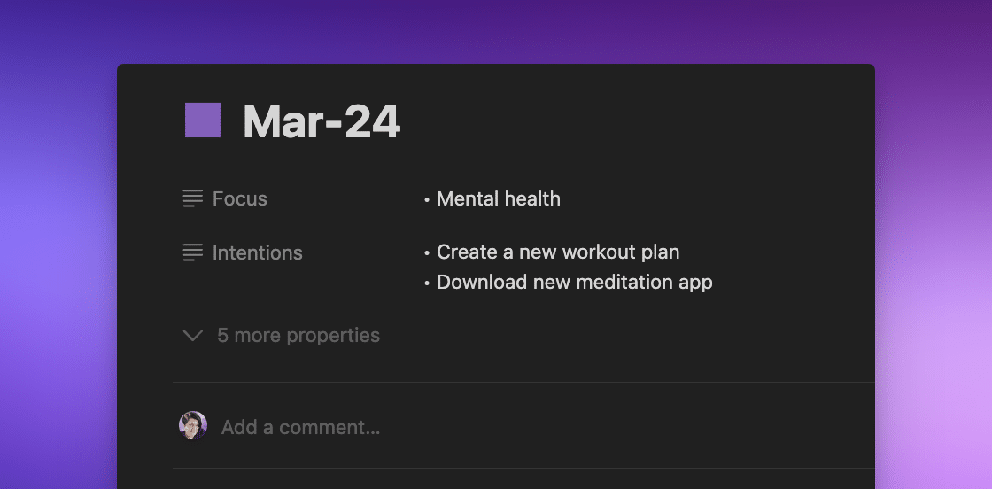
While this makes more sense, there’s still information being shown here that isn’t helpful for me.

As we can hide properties all the time, or if they’re empty, these are the properties that I’ve chosen to hide all the time in my journal example:
- Dates: I’m already inside the month page, I don’t need to see the dates (but they’re handy to have so that we can sort any view of the database chronologically)
- Daily Journal: I already know the days of the month, so seeing between 28 and 31 related pages here probably isn’t helpful
- Dividers: When the page is open, I can see the property name on the left, so I don’t need to have the divider to signpost me to what the information is
In Text properties, you can’t get bullet points like you can in Notion pages. However, there is a workaround! I use Option + 8 on Mac to give me faux bullets like this: •. Here are some other weird symbols you might like to copy and paste into your Notion pages:
• → ← ↑ ↓ ≥ ≤ ™ « » ∞ ≠ ° There are two ways to hide properties at the top of a Notion page.
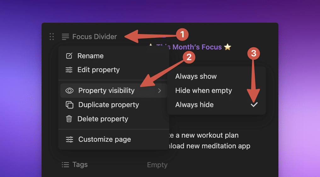
The first option is:
- Click on the property.
- Click on Property visibility.
- Change the visibility of the property.
This option is handy when you’re editing properties one by one.
Or, you can click Customize page at the bottom of the modal. This allows you to mass-edit which properties show and which don’t for this database.
Important: The ability to mass-edit which properties show and which are hidden is best used when you have a lot of properties you want to edit at once.
You can see in this image we’re customizing all pages in the Months database.
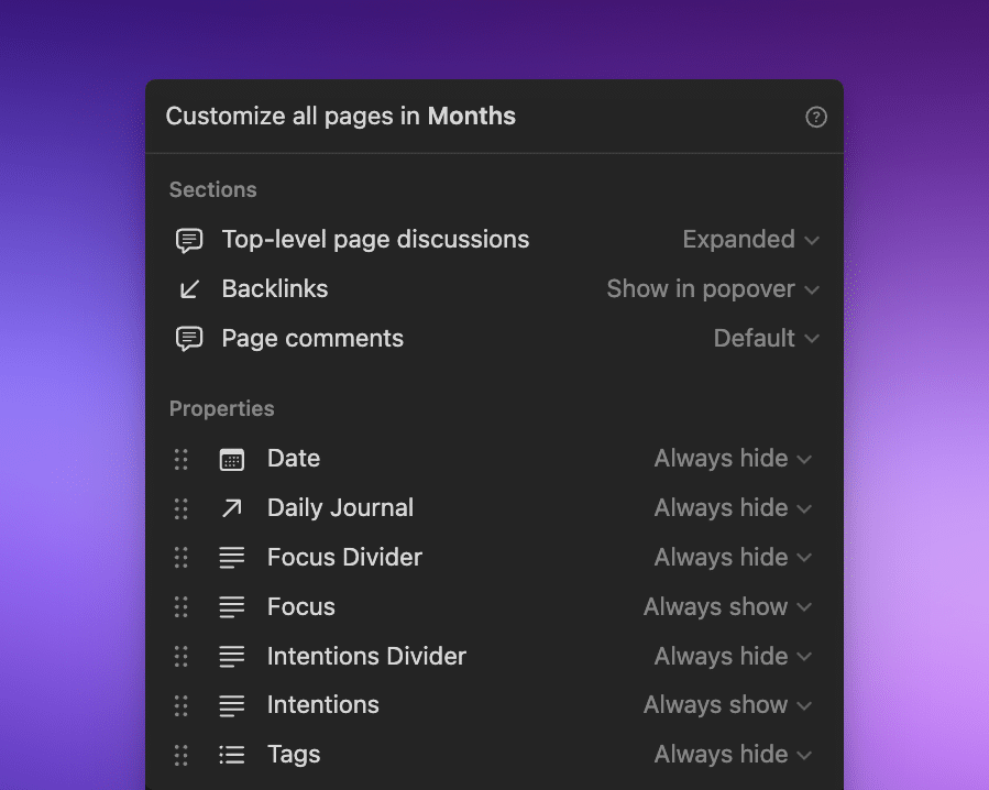
Using the second option also gives us the ability to change our sections, like showing Backlinks or not, and how to display Page comments. Note that anything you change here will be changed across the whole database.
Note: You can also use the 6 dots ⋮⋮ on the left of the properties to move them around.
When to use Hide When Empty or Always Hide Database Properties in Pages
This is entirely up to you, and each database might be different. I picked Always hide in our monthly example because they’re more signpost-type properties and don’t give me any relevant information at the top of the page.
If you want the property to show if there’s information in it, then you’ll want to select Hide when empty. Alternatively, if you want to make sure that a property is always filled out, you might want to select Always show.
15. Inline Text Styling
By now we already know three different font styles: sans serif, serif, and mono.
These are great, but they apply to the whole page and not specific sections.
So what can we do if we want a different kind of text inside the page without using funky LaTeX or creating an image and importing it (which won’t appear in a table of contents)?
Personally, I love using inline text styling for my headings. It’s not to everyone’s tastes, but I’m rather fond of it as an alternative to the standard fonts & colors.
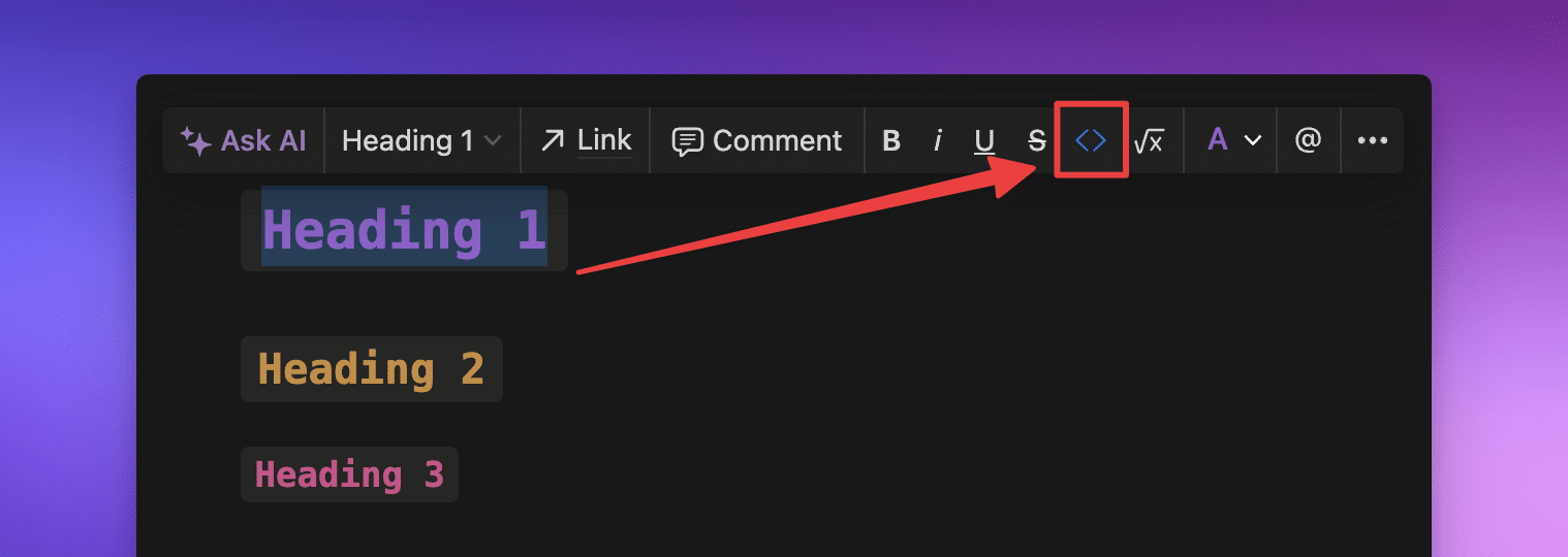
To use inline text styling for headings:
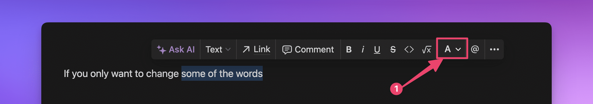
- Highlight the text you’d like to change.
- In the edit modal that pops up, click the
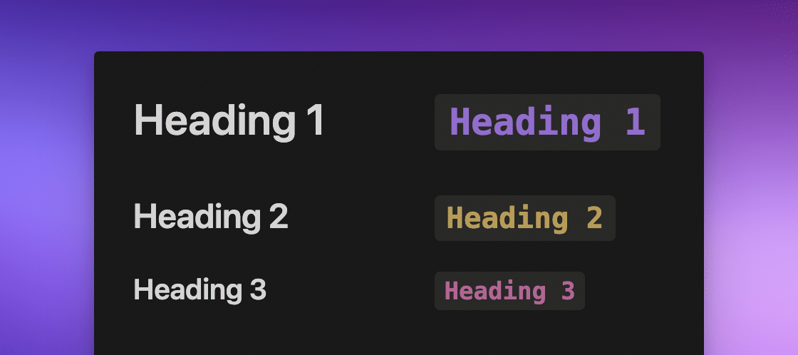
< >button. - Inline text styling is always added as red text. Head to the
Ato change the color (in the example below,Ais colored purple).
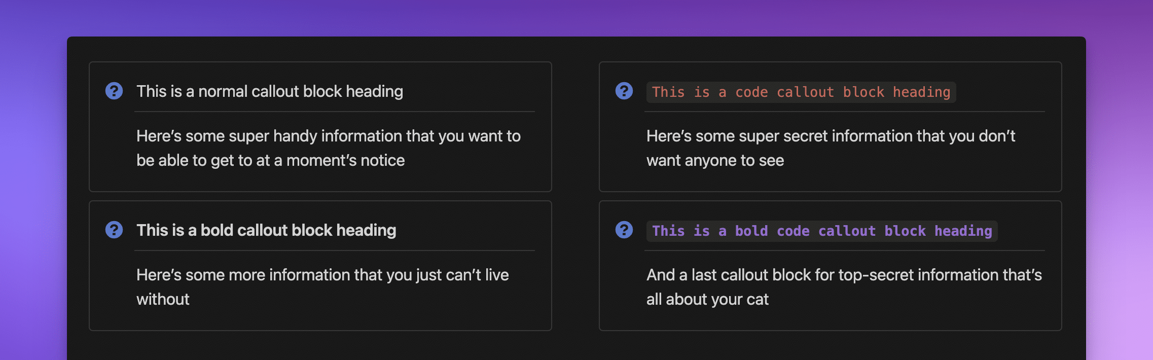
Note: This is the same font as the monospaced text styling for the whole page, but we can apply it inline within any normal text block. Simply wrap any text or headings in backtick symbols like this ` your text here ` to apply inline formatting without needing to highlight the text at all.
I also love using Callout blocks with code text to add visual interest to a dashboard.
Again, this is personal preference, and just because you can do it in Notion doesn’t mean you should. However, I really like it, so I wanted to share it with you!
16. Easy Color Change Shortcuts
One of the greatest things within Notion is the ability to change an entire text block to a different color.
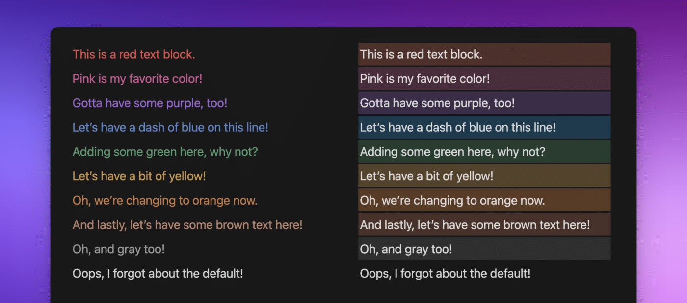
If you’re not sure about the color you want, the first way to do this is to type /color somewhere in the line. This will bring up the whole color palette in Notion, for both text and backgrounds, and you can pick from the palette.
If you already know the color you want, you can type /pur at any point to bring up just purple text or a purple background. This really saves time when you need to change colors regularly.
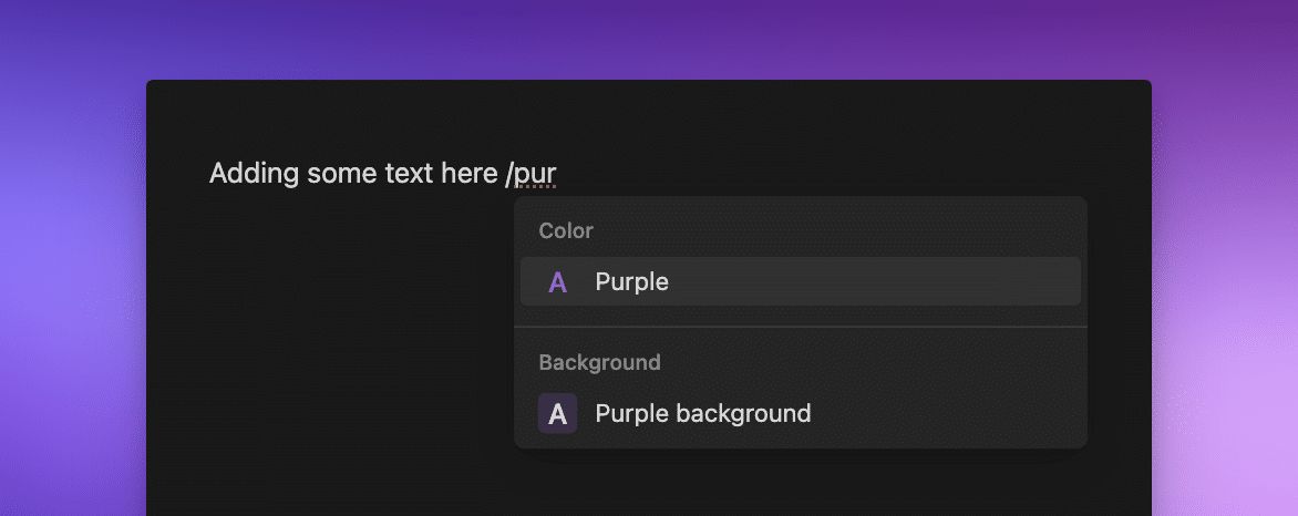
This doesn’t work only for purple, you can pick any color in the palette:
/gray/brown/orange/yellow/green/blue/purple/pink/red
To remove a color, you can use /default to return it to black text in Notion’s light mode, or white in dark mode.
The long-hand version of this is to navigate to the + ⋮⋮ on the left of any block, clicking it, then moving your mouse down to Colors and choosing the one you want, just the same as how we changed the background in Callout blocks earlier on.
Note: If you only want a portion of the sentence or block to be a different color, highlight the words, then click on the A to bring up the color palette and pick your color.
17. Viewing Sidebar Blocks on Mobile.
Most images we see online are sweeping screenshots of stunning dashboards on Notion desktop, not on mobile. Some of them have a “fake” sidebar on the left to create their own menu, and usually this is created as a Callout block to create their own menu system.
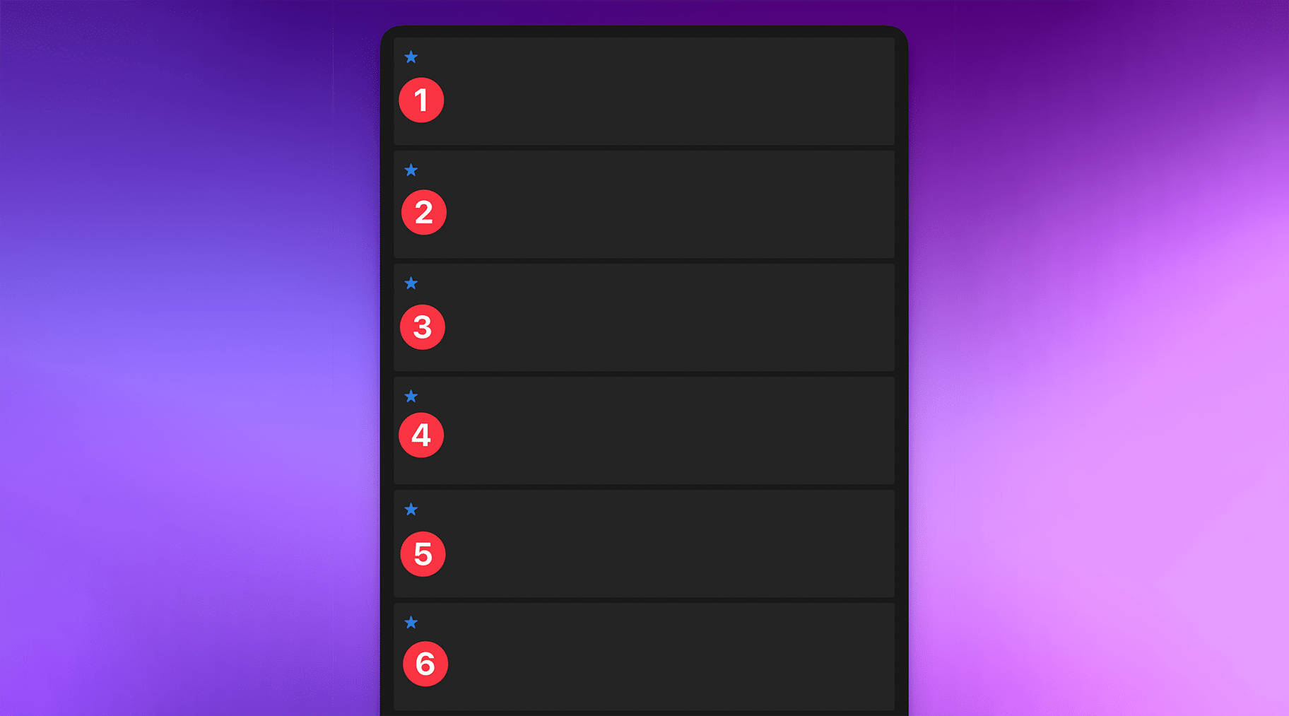
In the screenshot below, the menu is generally created in block 1, and on desktop it looks great. But it’s utterly useless on mobile because Notion stacks any columns you’ve created into one. The numbers show how Notion will stack these blocks.
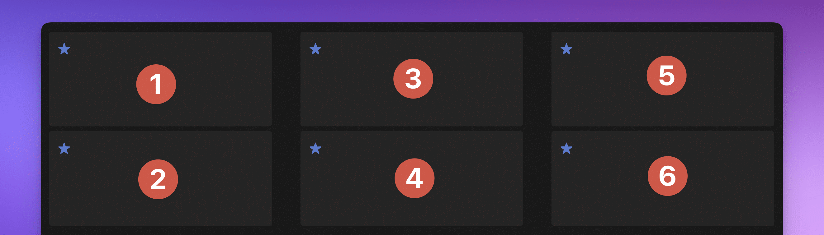
The only thing worse than having your menu navigation on the left, is when you have a sidebar menu on the right.
On mobile, that will be right at the bottom of the page (section 5 in the image).
In these examples, there isn’t a great deal of information in any of those blocks or columns, but imagine how cluttered it would look on mobile if these were full of databases and toggles!
My personal preference is to create a Notion page as a dashboard that looks amazing on my desktop and perfectly aligns with what I want to do while I’m at my computer, and then another that’s specifically optimized for mobile.
Both of these views contain similar information; my desktop version contains a full Table view with multiple properties showing, and my mobile version has a List view with only a couple of properties showing.
Incidentally, Thomas’ Ultimate Brain template already comes readily equipped with desktop-optimized dashboards (like Notes), where each dashboard section links to a mobile-optimized, single-purpose page (like Notes → Favorites).
Note: If you use Notion in this way—on mobile and phone—you might benefit from creating device-specific dashboards as well. If you can, create a bookmark on your phone’s home screen that takes you straight to your mobile-optimized page, then there’s no switching around on your phone! Take that as your extra bonus tip!
What Will You Do to Personalize Your Notion Space?
So, those are 17 of my top tips to make Notion more aesthetic without a 3rd-party widget in sight!
The beauty of Notion is that we can make it what we want, when we want, and how we want.
However, when people talk about aesthetics in Notion generally, they’re referring to gorgeous screenshots on social networking sites and think their Notion space isn’t “right” unless they include a billion images and widgets.
Your Notion space should allow you to get the work done, whether that’s tracking your fluid intake, writing blog posts, logging your runs, or running your business empire. The tips I’ve shared in this article show how to reduce visual overwhelm in your Notion space and make it more cohesive without compromising on getting the work done.
Now all that’s left is to take the tips that resonate with you the most and find your personal Notion aesthetic!
More Resources
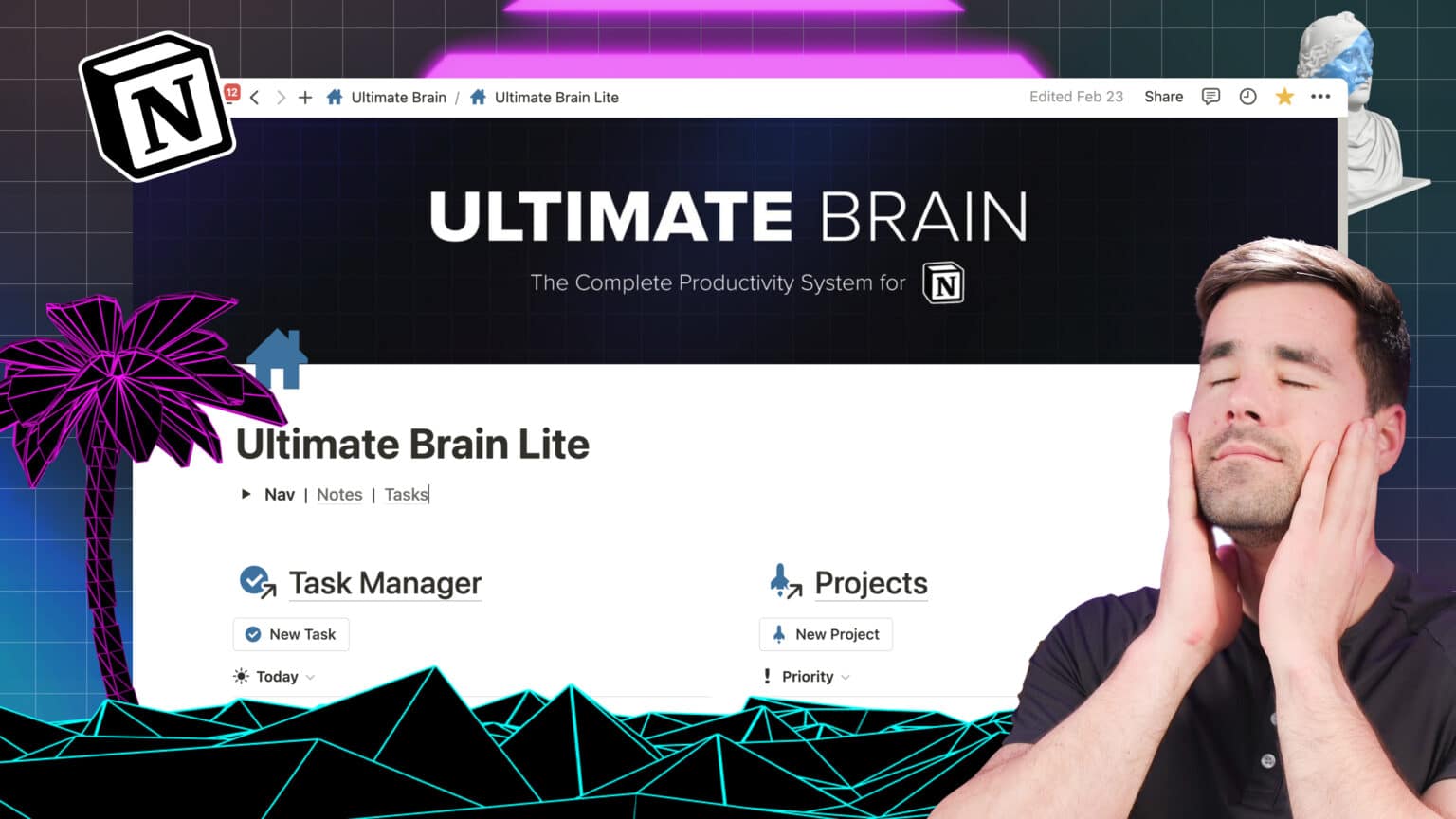
If you enjoyed this article on some common and not-so-common aesthetic changes you can implement in Notion to make your space more cohesive, I’d love to recommend Thomas’ Ultimate Brain for Notion.
It’s full of databases and dashboards for advanced project management and is a complete productivity system from a certified Notion Expert!
Want to turn Notion into a complete productivity system? Ultimate Brain includes all the features from Ultimate Tasks - and combines them with notes, goals, and advanced project management features.
Finally, you can join his Notion Tips Newsletter if you’d like to be notified when Thomas, myself, or anyone on the team publishes new templates, tutorials, and articles. As a bonus for signing up, you’ll get access to Thomas’ free templates, plus cheat sheets and reference guides. It’s a treasure trove of Notion knowledge, just for you!
 Author: Esme Crutchley, Notion Certified
 Reviewer: Thomas Frank, Notion Certified